Retro Automotive Poster Design, The Black Spur Trophy of 1976
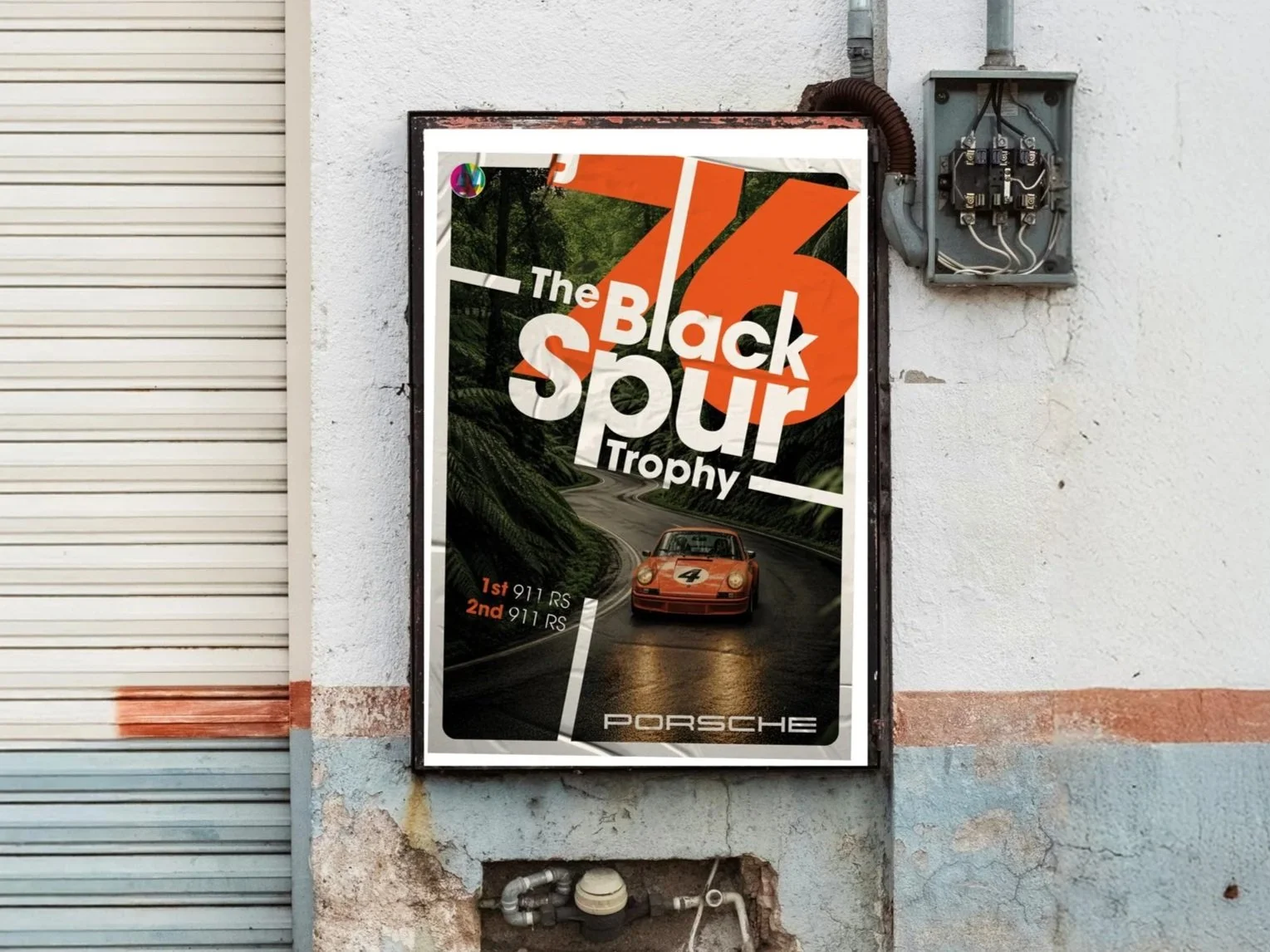
This is the kind of work I want to do more of: strong ideas, great imagery and graphic design with enough confidence to take over the page.
The Black Spur Trophy, 1976 is part three of my automotive poster series. It brings together three things I genuinely love working with: cars, images and expressive typography.
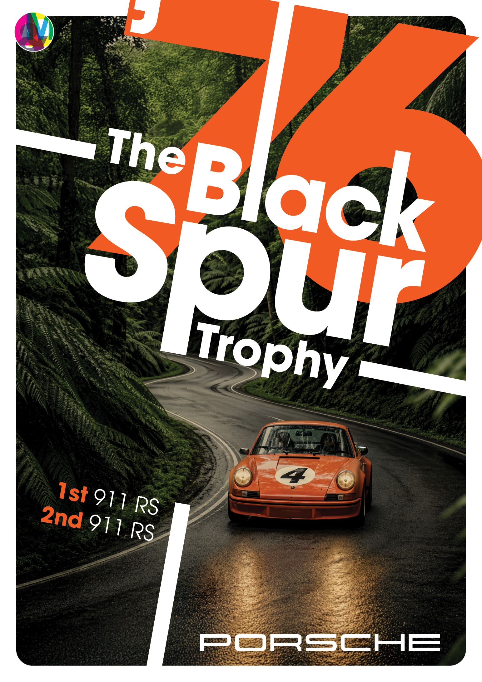
The poster imagines a fictitious road race through Victoria's Black Spur, with a Signal Orange, 1973 Porsche 911 Carrera RS coming through the forest.
It isn't intended to reproduce a real event or an original Porsche racing poster. Instead, it explores what the Black Spur Trophy might have looked like if it had existed, and what a graphic designer working in the 1970s might have done with it.
Beginning with an idea, not a layout
The starting point was the Black Spur's character.
The road winds through dense forest between Healesville and Marysville, creating a setting that feels ideally suited to a fictitious 1970s road race. It is narrow, dramatic and visually distinctive, the kind of place where a lightweight Porsche 911 RS feels completely at home.
That gave the project its central idea: an imagined piece of Australian Porsche racing history.
From there, the task wasn't simply to place typography over a car image. It was to create a complete visual language around the event, one that connected the car, the road, the year and the spirit of 1970s motorsport.
Designing with the image
A strong automotive image is a great starting point, but it shouldn't carry the entire design.
For this poster, I treated the image as raw material rather than a finished composition. The car, road, forest and typography all needed to work together to create a single sense of speed and direction.
The oversized '76 provides the page's main structure. It immediately establishes the period, but it also works as a bold graphic shape that moves through the composition.
The title cuts across both the numerals and the image, rather than sitting safely above or below them. Angled white rules follow the Porsche's movement and the road's changing direction, helping lead the eye through the poster.
Some elements are deliberately cropped or pushed beyond the edges. Others collide and overlap. The intention was to give the design energy and tension, rather than letting everything sit politely in its own space.
Drawing on 1970s motorsport design
The visual language draws on the more experimental side of 1970s European motorsport poster design.
It uses oversized typography, tight spacing, assertive cropping and an asymmetric composition. The hierarchy is clear, but the layout does not feel rigid or overly controlled.
The period influence is there without relying on the usual collection of retro effects. No decorative racing stripes, artificial paper textures, or distressed type are added to make the poster look old.
Instead, the sense of the 1970s comes from fundamental design decisions: scale, proportion, colour, typography, and how the elements interact with one another.
That distinction matters. Referencing a period should be about understanding how designers approached a page and not just borrowing the most recognisable physical cues.
Signal Orange as a design element
The Porsche's Signal Orange paint became the foundation of the colour palette.
Repeating the orange through the oversized '76 connects the graphics directly to the car. This helps the typography and image feel like parts of the same composition rather than two separate layers.
Against the dark greens of the forest, the orange also gives the Porsche a strong visual presence. It pulls the car forward and creates an immediate focal point, while the white typography provides contrast and keeps the information legible.
The Porsche wordmark sits more quietly at the bottom of the poster. It does not need to compete with the car or the event title. The shape and colour of the 911 already do much of that work.
More than a Porsche poster
Although this is an automotive poster, the thinking behind it is the same thinking I bring to commercial graphic design and creative direction.
A strong image is only the beginning. The real work is understanding the message and finding the visual idea that gives it energy, character, and a reason to be remembered.
That might mean building a campaign around one distinctive concept, strengthening the relationship between words and images, or pushing a layout beyond the safest, most predictable solution.
This project reflects the kind of work I want to create more of: graphic design, campaign concepts, posters and visual identities with a clear point of view.
If you are working on an automotive, sporting, cultural or lifestyle project that could benefit from this kind of creative direction, campaign design or poster work, I would love to hear about it.