Automotive Graphic Design and The Pacific Hwy 500 Poster
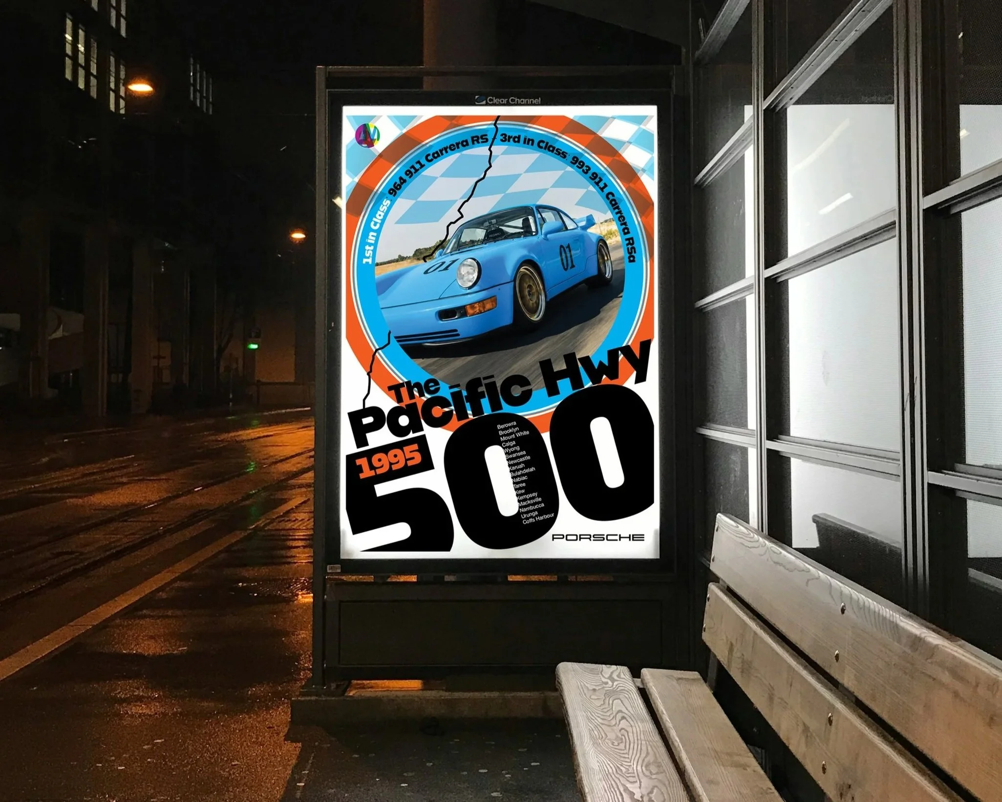
The Porsche poster rabbit hole continues. It seems that one imaginary road race wasn't enough.
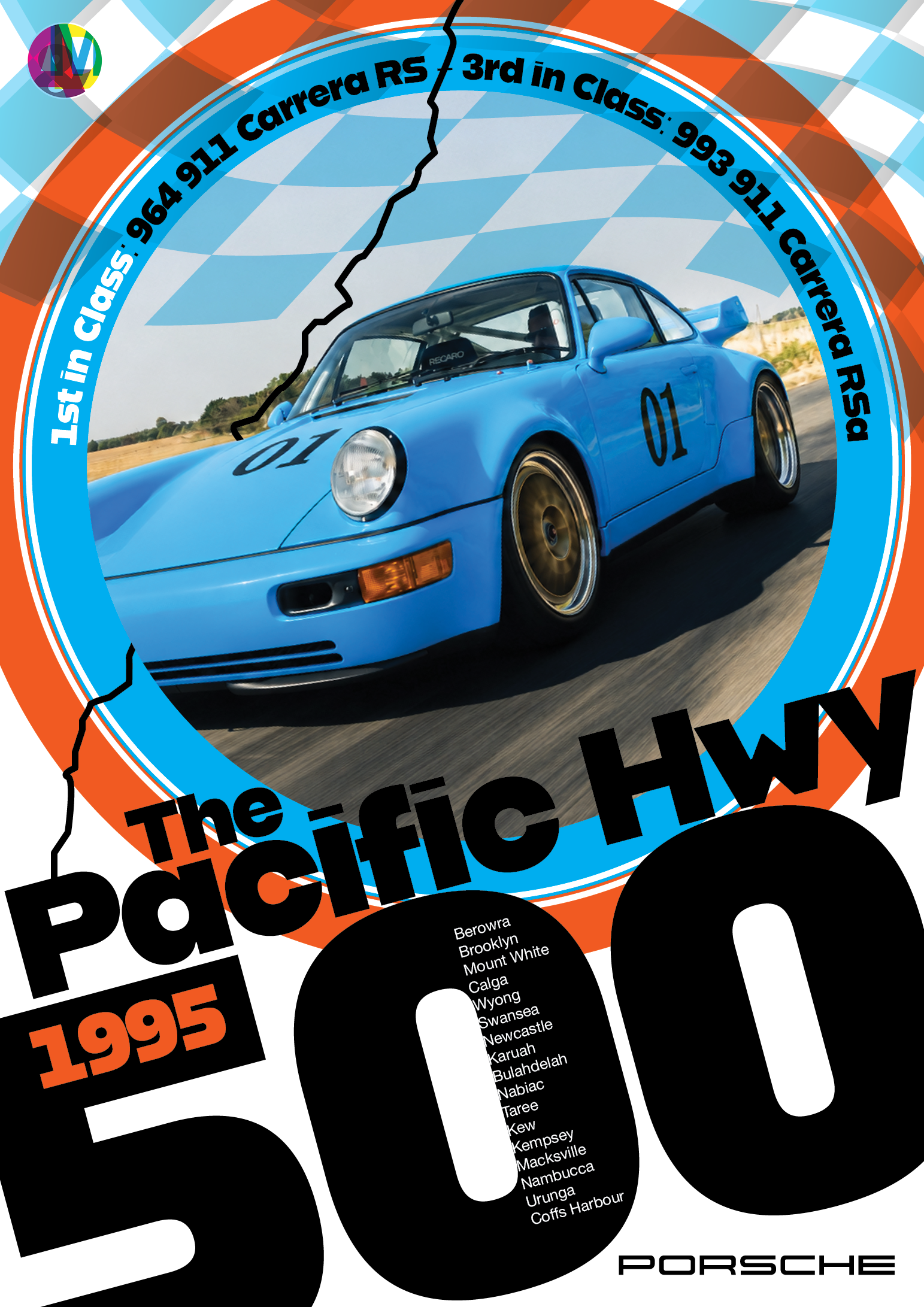
Part four of my poster series is The Pacific Hwy 500, 1995, a made-up road race up the old Pacific Highway and a perfectly reasonable excuse to build a design around a blue 964 RS.
It's a personal project combining cars, images and graphic design. It's also a good example of the work I'd like to do more of at Austin Media & Design: distinctive posters, automotive campaign creative and expressive design built around a strong idea.
A blue Porsche and a slightly unreasonable layout
The Porsche 964 RS gave this poster its starting point: a compact, purposeful Porsche with enough visual character to hold its own against some fairly assertive graphics.
Rather than placing the car neatly beneath a headline, I wanted the image and typography to compete a little. The Porsche fills the circular frame, bringing the viewer close to the action, while the title and enormous '500' push across the lower half of the page.
The car gets your attention. The rest of the design gives your eye somewhere to go.
That relationship is what interests me about automotive poster design. A great car image is valuable, but the design should contribute something of its own and not just provide a place for the date and a logo.
Taking the graphics into the '90s
Each poster in the series explores a different imagined event and a different graphic direction.
For the Pacific Hwy 500, the setting is 1995. The design leans into the '90s with saturated blue and orange, layered chequered graphics, curved lettering, and type big enough to read from the next postcode.
The blue carries directly from the Porsche into the circular frame. Orange adds contrast and stops the composition from becoming too comfortable. Behind it, the overlapping shapes suggest a chequered flag without turning the whole thing into a predictable collection of racing stripes.
The period is a starting point, not a set of rules. I wanted the poster to have the energy of a motorsport design from that era, but still feel like a fresh piece of work.
Road-trip storytelling amongst the visual shouting
The fictitious race gives the poster a story beyond the car.
A black line representing the old Pacific Highway cuts through the composition, connecting the image to the journey. The towns heading north are tucked inside the enormous '500', making the route information part of the typography rather than a separate block of small print.
Those details reward a closer look. From a distance, you see the blue Porsche, the colour and the oversized lettering. Up close, you discover the journey and the imagined race results.
I did my best to squeeze a little road-trip storytelling amongst the visual shouting.
From a personal project to commercial design
There's no actual Pacific Hwy 500 race behind this poster, and it isn't an official Porsche commission. It's a bit of "what if?" and the pleasure of pushing a layout until it starts doing something interesting.
But the approach has a practical commercial application.
For an automotive business, event organiser or lifestyle brand, the challenge is often bigger than finding an attractive image. It's finding a clear visual idea that connects the subject to the message—and then making it work across the places people will encounter it.
That could mean a launch poster, an event campaign, a print advertisement, a brochure or a series of social graphics. The formats change, but the work needs a recognisable character and a consistent thread.
This is where creative direction and graphic design come together: deciding what the work should communicate, then using imagery, typography, colour and composition to make that message land.
More work with character
At Austin Media & Design, my independent Sydney studio, I work directly with clients on graphic design, campaign creative and print and digital content.
I'd love to bring more of this approach to automotive projects, motorsport events, surf and sporting brands, and businesses looking for something with a stronger point of view.
It doesn't all need to involve a blue Porsche or enormous numerals. Although I'm certainly not ruling either out.
If you've got a project that needs some character, strong imagery and confident design, let's talk.
Get in touch with us to discuss poster design, automotive graphic design or campaign creative.