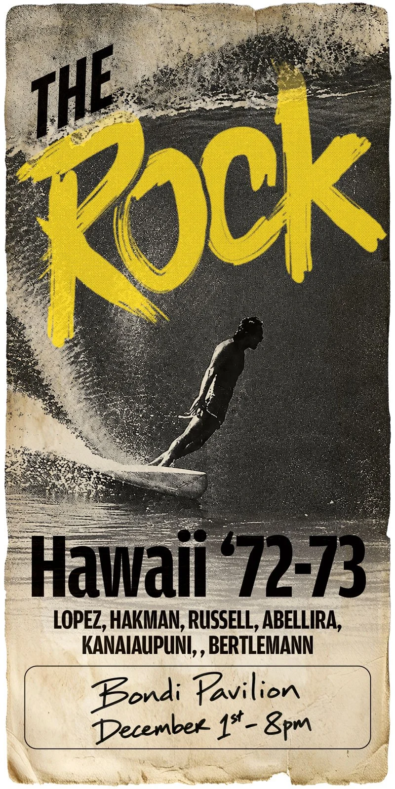
A 1970s Surf Film Poster.
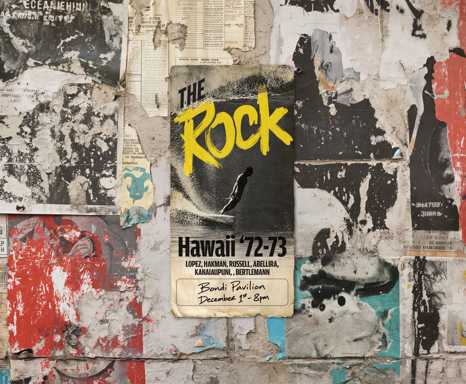
The rabbit hole has moved from cars to surfing.
I've been working on some fun, slightly random personal design projects lately, mostly because I genuinely enjoy this kind of work. After a run of imaginary Porsche racing posters, this time I've gone back to another long-time obsession: surfing.
The result is The Rock, an imaginary surf film set in Hawaii in 1972–73, featuring Gerry Lopez, Barry Kanaiaupuni, Larry Bertlemann and some of the other surfers associated with that extraordinary period in Hawaiian surfing.
The film doesn't exist. Neither does the screening I've advertised at Sydney's Bondi Pavilion. But that's really the point.
Designing a surf poster that looks genuinely old
I didn't want to make a contemporary poster with a couple of retro fonts thrown onto it and call it "1970s".
The idea was to create something that felt as though it had actually been designed, printed and pasted to a wall in the early 1970s—and somehow survived.
I wanted the poster to look like it had been sitting on a wall somewhere that hadn't seen daylight since 1975.
That meant deliberately working against what normally makes graphic design look polished: rough printing, limited colour, oversized hand-painted lettering, imperfect registration, battered paper, fading, texture, and plenty of visual noise.
The typography is deliberately bold and crude. The black-and-white surf photography does most of the storytelling, while the yellow gives the poster a simple, economical colour hit that could have come from a low-budget print job.
Even the fictional Bondi Pavilion, December 1st at 8 pm notice was treated as something that might have been added by hand rather than carefully typeset as part of the original artwork.
The pleasure of designing something for no reason
There's something truly enjoyable about making a piece like this just for the sake of making it. No client. No brief. No revisions.
Just disappearing down a creative rabbit hole and seeing where it ends up.
The funny thing is that in 1972 this was probably the sort of job some designer got paid five bucks to knock out before lunch. More than 50 years later, I'm spending hours trying to make it look like they did.
And that's part of what makes it interesting.
Recreating old graphic design isn't really about finding the right vintage font or adding a distressed texture. It's about understanding how someone would have made the original piece, the printing limitations, photographic reproduction, available type, materials, and all the little imperfections that came naturally with the process.
Those limitations are often what gave the work its character.
Cars, surfing, photography, typography and print
So that's what I'm doing with some of my spare time at the moment.
Cars. Surfing. Print. Photography. Typography. Imaginary events. Old-school graphic design.
They're personal projects, but they're also an opportunity to experiment with ideas and techniques that don't always have a place in everyday commercial design work.
And if disappearing down these particular rabbit holes leads to more interesting graphic design, poster, print or creative work, even better.
Reach out if you’re looking for something.
Robin Austin is a Sydney graphic designer and creative director at Austin Media & Design, working across graphic design, print, websites and digital strategy.